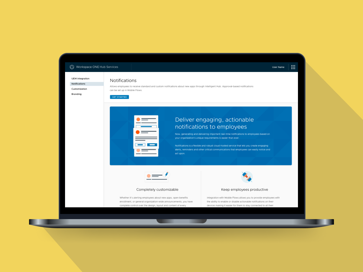
Workspace ONE Hub Services Notifications
My Role: UX Lead, Interaction Designer, UX Researcher Team: Visual Designer, Content Writer Tools: Axure, LICEcap, Confluence Deliverables: Wireframes, Prototype, Usability Test Readout
Project Background
Workspace ONE Intelligent Hub is the app employees use to register their devices to gain access to resources within the organization. Click here to learn more about the product.
Workspace ONE Hub Services is the admin console to configure all aspects of Intelligent Hub for the employees.
Notifications is a new feature in Hub Services. Workspace ONE Notifications Service supports creation of custom notifications through APIs. APIs are not user friendly for non-developers. We want to make it easy for IT admins to create custom notifications for Intelligent Hub by configuring it through an admin UI. Admins should be able to go to Hub Services console and not only turn on/off notifications but also be able to configure custom notifications.
Requirements
- Allow admins to create custom notifications targeted to all users in company, a particular OG or AD group, or a set of devices on a given platform.
- Allow admins to enter details for notification like header, image, description, action, etc.
- Allow admins to preview the card as they enter the details.
- Allow admins to set priority.
Clarify Requirements with Product Manager
After reading the four-bullet requirements, I had a lot of questions. I realized I need to figure them out before jumping into the design. I wrote my questions down and posted them on the requirement Confluence page. Also, I set up a meeting with PM to go over these questions in details.
Concept Creation
After I understood requirements, I started drawing sketches on whiteboard and then creating concepts in Axure. Here is an example.
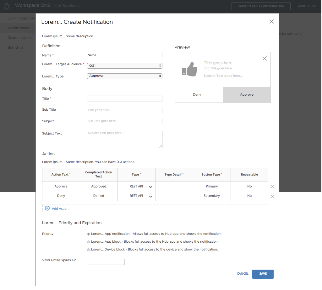
The Create Notification page is getting too long, so I broke it down to a wizard. Later, I combined Assignment with Accessibility into one step: Definition, because both sections are pretty short.
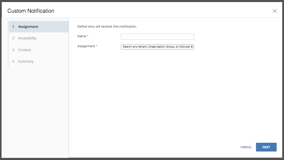
The third step Content is still a very long form, especially when admin uses three actions.
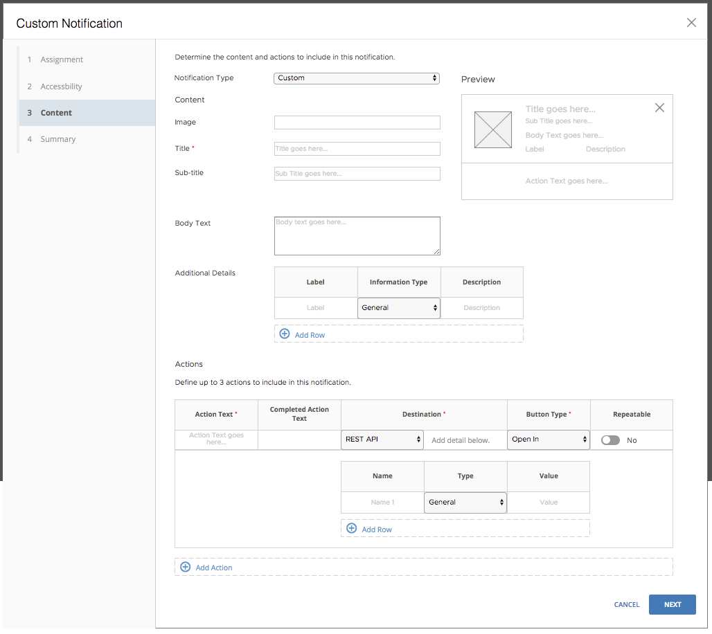
I was not happy with the Actions section in this concept, because it looks complex and confusing, having a list builder within a list builder. I showed the concept to a few other designers on the team during the design review. They were confused about how it works. It would definitely confuse IT admins, I thought to myself. In order to make the design better, I created two more concepts for the Action section.
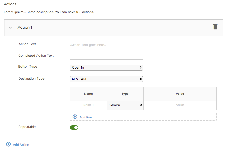
Concept 1: Using the stepper/worksheet component. This design prevents the page from getting too long, because admin can collapse each action.
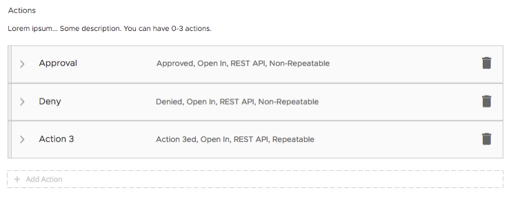
When actions are collapsed, IT admin can see a high-level summary of each action, like this:
Concept 2: Using tabs. This design also prevents the page from getting too long, however, the high-level summary view is not available.
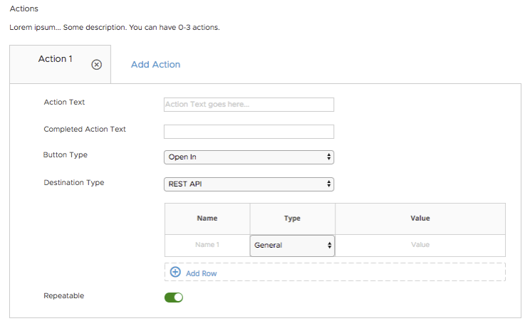
I presented both concepts during the design review. After comparing pros and cons for each one, I decided to move forward with concept 1, not only because of the summary view, but also admins’ familiarity level of the stepper pattern within the product.
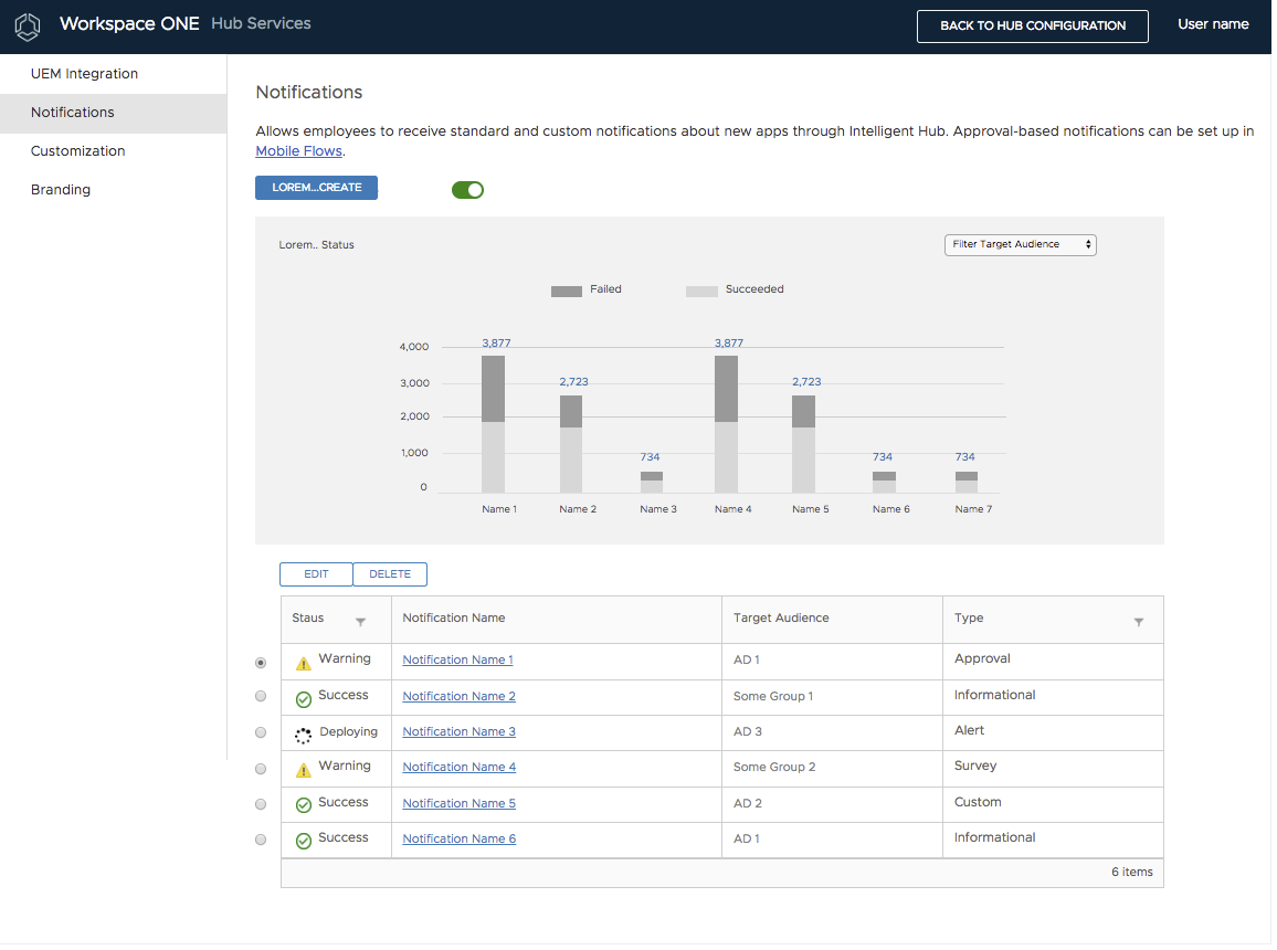
Here is a wireframe for the Notifications list view.
Visual Designer (Done by Visual Designer)
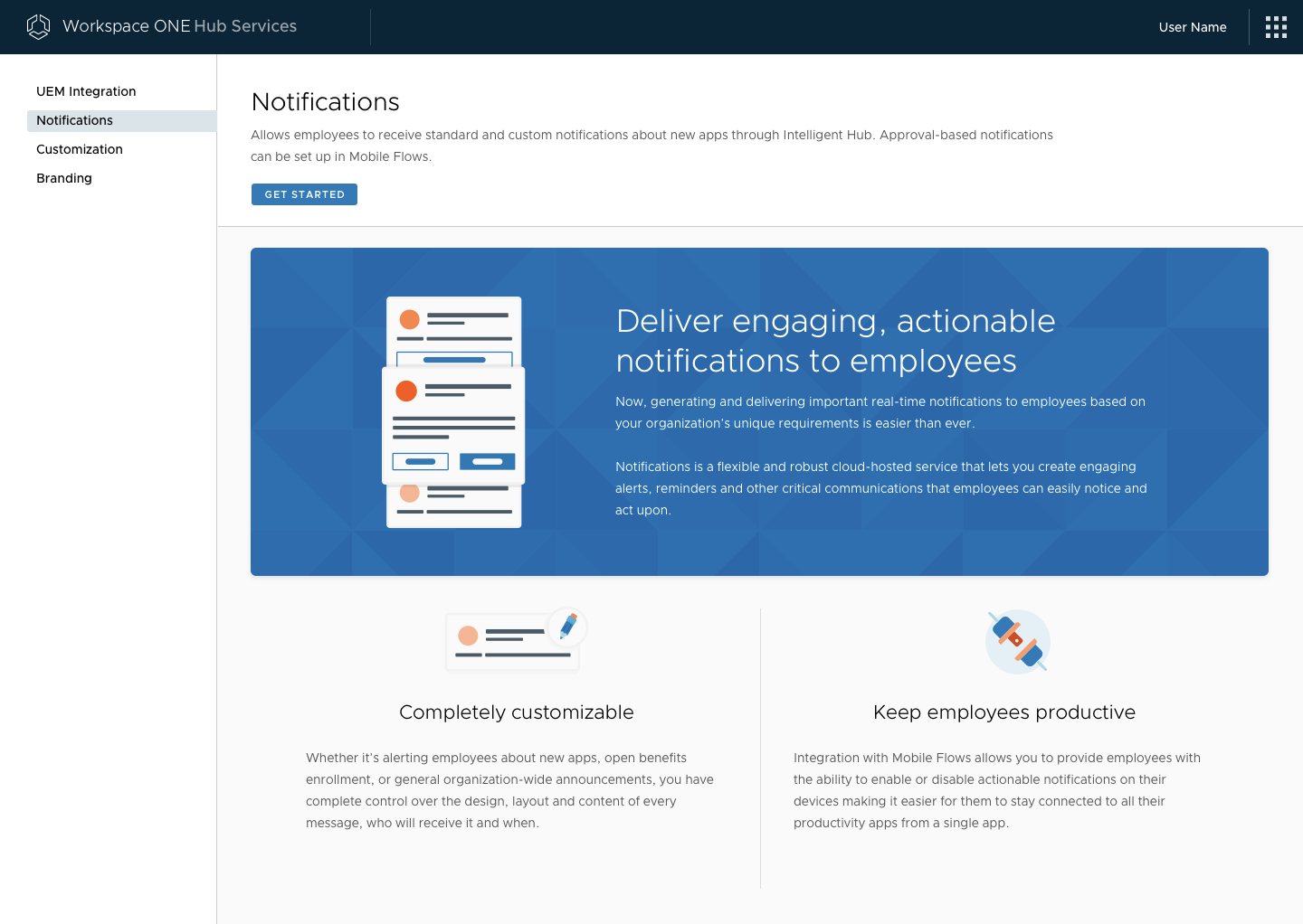
The first-time user experience page.

The first step of the wizard: Definition.
Usability Testing
I conducted 5 usability tests with VMware internal IT admins.
Here are the research questions:
- How easy is it for admins to create a custom notification?
- Do admins understand all fields in the Custom Notification wizard?
- Where do admins stumble on and/or feel confused about?
I invited PMs and devs to some sessions, so that they could directly hear feedback from our internal users.
After data analysis, I created the usability test finding readout, pointing out clear user pain points and actionable recommendations. I presented the readout to both PMs and dev leads. They found the readout to be very insightful. We were able to make some usability improvements in the next phase based on what we found during the usability tests.
Closing Thoughts: Collaboration – It’s a team’s work! Communication is crucial, especially when the whole team is in three time zones. I was based in Atlanta. PM was based in California. Devs were based in India.
How I worked with Product Manager
I took initiatives when working with PM. I asked PM a lot of questions during the requirement clarification phase. I also asked PM to include me in customer meetings, so that I get to hear what customers say about this product/feature. I’ve kept PM posted with the UX team’s progress by scheduling a weekly PM/UX sync meeting. I voiced concerns when UX timeline is at risk or IT admin experience is being compromised greatly.
How I worked with Visual Designer
I’ve included the visual designer in all design meetings, so we both understand use cases and requirements from the very beginning. I asked feedback from the visual designer on wireframes. Once visual designer is done with draft mockups, I reviewed them and provided feedback. What’s more, I challenged and brainstormed with the visual designer to make key screens more visually appealing.
How I worked with Mobile Designer
The preview on the admin UI needs to match the notification card on mobile. I worked closely with mobile designers, to make sure together we are providing a consistent experience to admins and employees.
How I worked with Content Writer
I started involving the Content Writer when wireframes are finalizing. I gave the Content Writer an overview of the feature and brainstormed labels and descriptions with him on every page.
How I worked with Developers
Early in the design process, I scheduled several meetings and reviewed wireframes with both PM and developers. When devs were implementing this feature, I helped answer UX questions they asked, and provided updated wireframes to support scenarios that were needed last minute due to technical constraints.