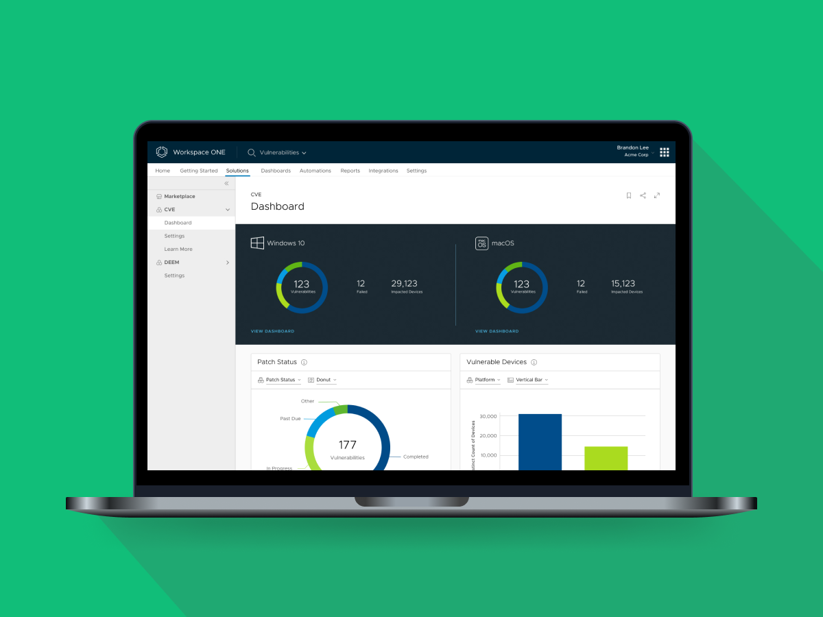
Vulnerability Management Dashboard
My Role: Product Designer Design Tool: Figma Deliverables: High-fidelity mockups, prototype
Overview
Designed and released vulnerability management dashboard in Workspace ONE Intelligence.
Problem Statement
IT admins didn’t have visibility to manage vulnerabilities across platforms (Windows 10 and macOS).
Workspace ONE Intelligence
Workspace ONE Intelligence aggregates and analyzes data from multiple sources to support reporting, dashboards, automation, alerts, and Machine Learning across all End User Computing services. IT teams get integrated insights and automations to proactively improve digital employee experience, strengthen security risk compliance, and optimize IT operations.
CTO’s Keynote
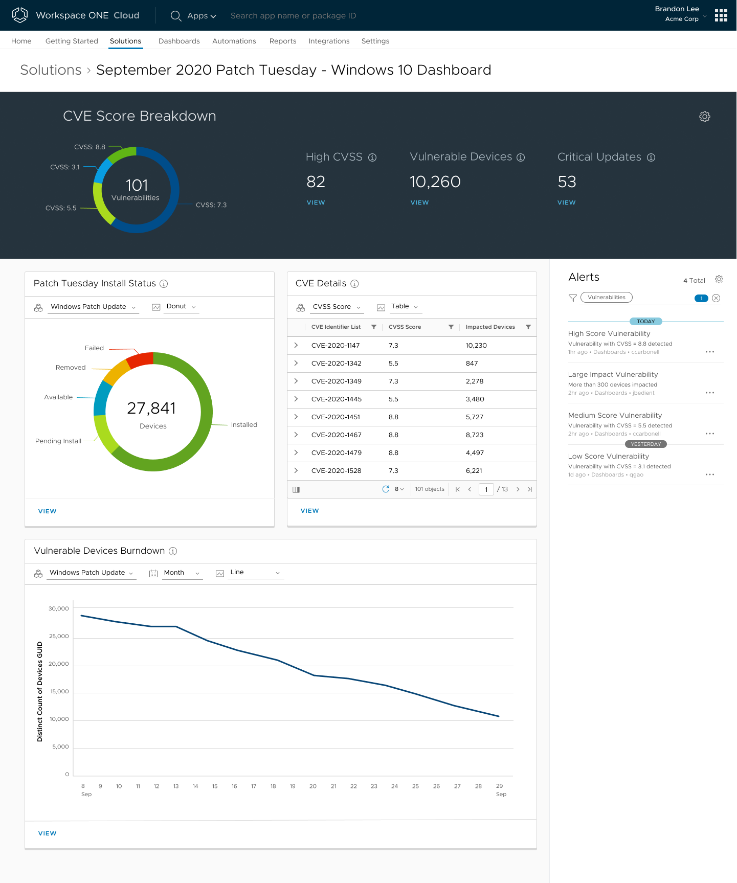
My initial goal was to deliver screens for a new Common Vulnerabilities and Exposures (CVE) dashboard to be presented during the CTO’s keynote at VMworld 2020. Despite the short period of time before the event, the screens still needed to look very polished and tell the right story. Here is one of the mockups I created for the keynote:
Internal Customer Interview
After VMworld 2020, I continued to work with the Product Manager (PM) and Engineers to implement the feature in a release.
To get more user-oriented feedback, I walked a few internal customers (VMware IT admins) through the initial screens. During these sessions, I learned about their pain points and goals. They made it very clear that being able to track progress toward patching goals (Service-level Agreement Target) was key.
Designs for SLA Progress
When designing the vulnerability detail page, I focused on the SLA Progress section. Here are a few options that I explored:
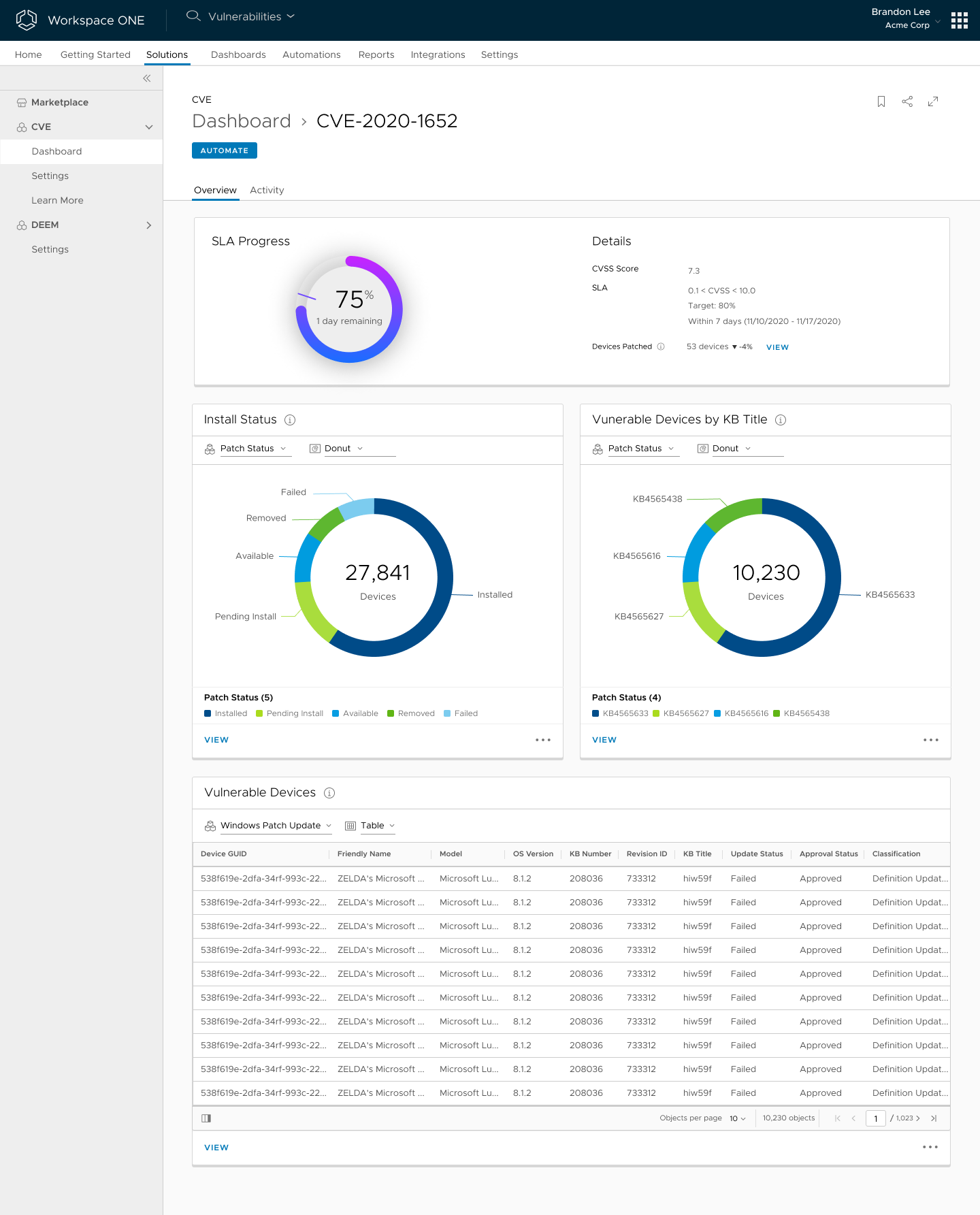 Since the SLA Progress section is the most important piece of information for IT admins, I explored a bright gradient with a drop shadow to highlight the donut chart. However, the style of the donut chart diverged too much from other charts in our console.
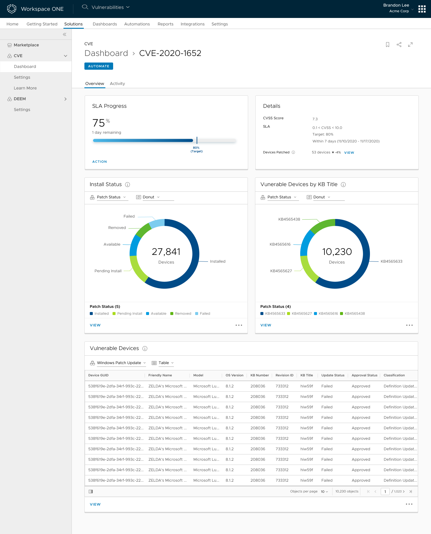 Instead of a donut chart, in this concept, I explored a progress bar. Also, I separated SLA Progress and Details into two cards, and used a two-column layout similar to other pages in our console. In the end, I found this layout too predictable and boring.
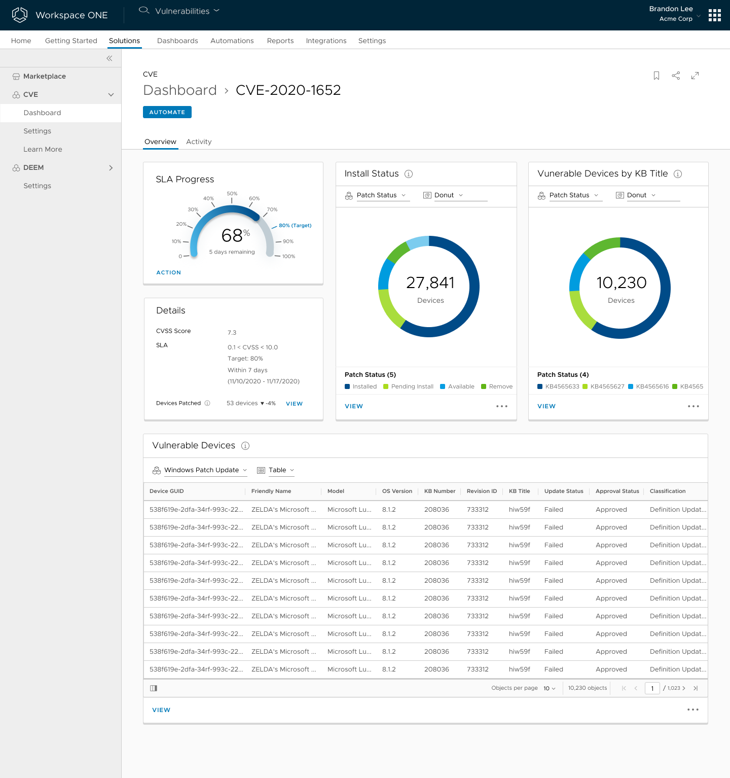 Thus, I tried another layout, three columns, by stacking the SLA Progress and Details cards vertically. Also, in this concept, I used a gauge chart to show the SLA progress. This got us close to the final design, but a few more tweaks would be in order.
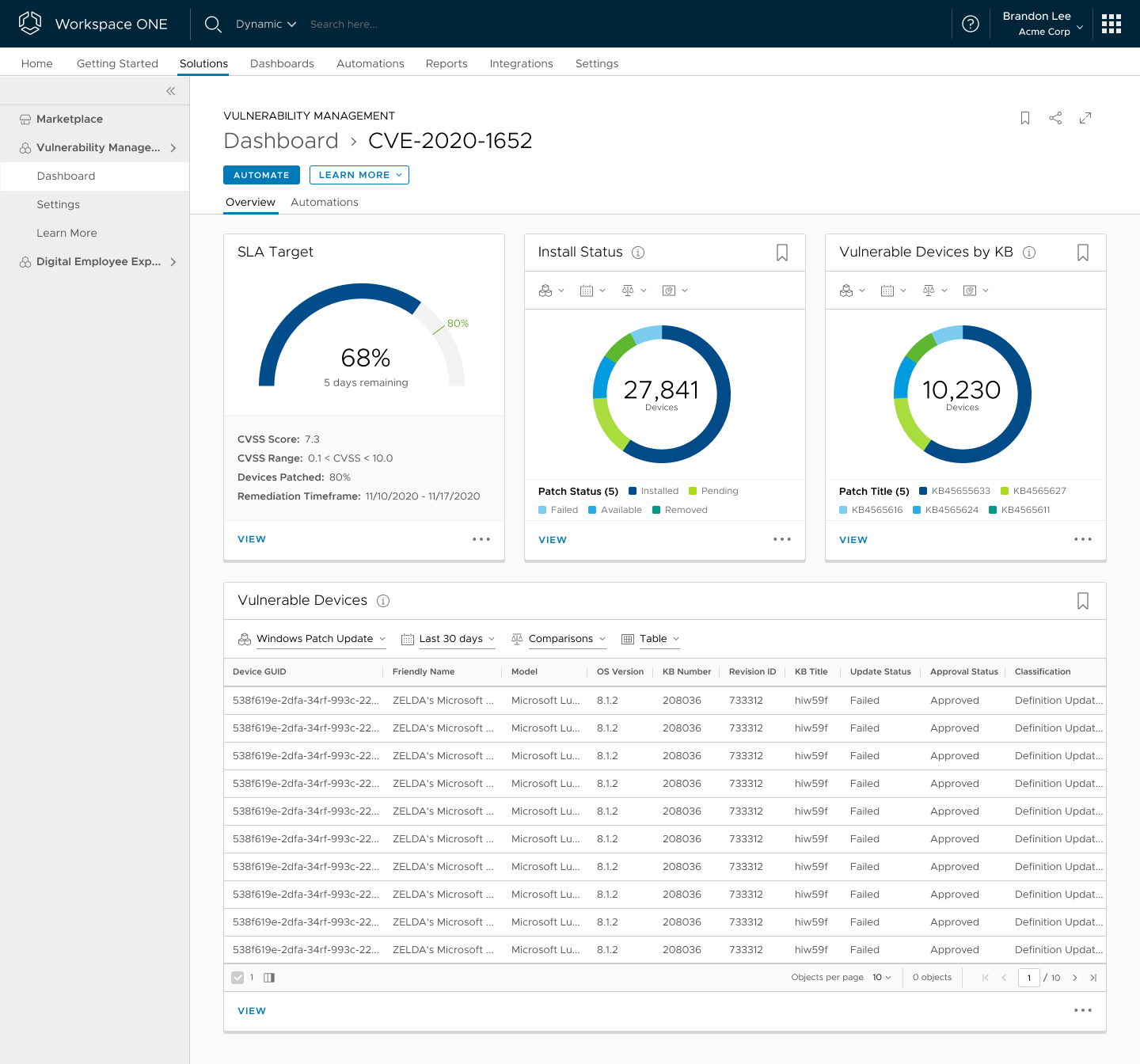 Here is the final design. I removed unnecessary labels and made the gauge chart look clean and easy to read. I combined SLA Progress and Details back into one card. To make the gauge chart standout, I added a light grey background to the details section.
During implementation, the front-end engineer told me the library they used didn’t support labels on a gauge chart. After some back and forth, we kept the layout, but went with a progress bar, which isn’t ideal, but worked as a compromise.
More Screens
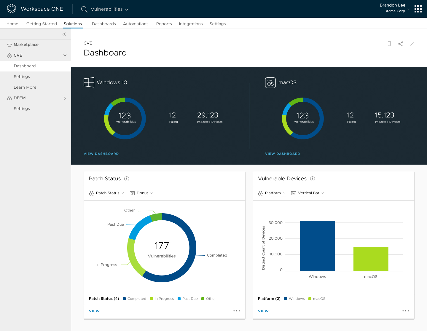 CVE Main Dashboard
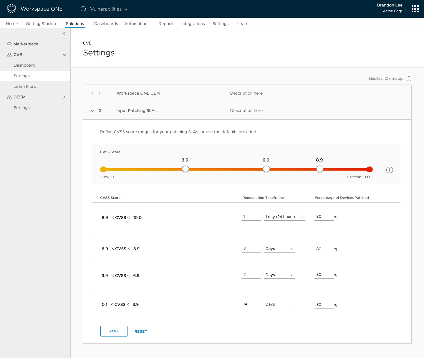 CVE Settings